Some aspects (common problems and opportunities) that deserve special attention in travel sites.
By jordisan.

Some aspects (common problems and opportunities) that deserve special attention in travel sites.
By jordisan.
And how to deal with them.
In most travel websites the search form is already the main functionality and it’s visible enough. However, some of them include too much information and/or too many options, especially on the home page: search forms, offers, packages, last-minute bargains, etc. ; sometimes it seems like someone has just dropped them on the page, with no obvious structure or grouping into sections. This may require an extra effort by the users to find a starting point to start their navigation; it’s common, for example, to find plenty of beautiful images of idyllic places which may have an aesthetic purpose but don’t help users to find what they’re looking for (unless it turns out they are images of their destinations).
Let’s remember that one of the “commandments” of user experience is that the vocabulary and behaviour of the website must be targeted to users instead of reflecting the internal structure of the company. However, some websites still include some contents and classifications which aren’t obvious at all to end users.
It’s better to avoid designs where everything is trying to stand out and use options which are easy to understand. It’s important for users to identify a clear starting point depending on their needs and their profiles (we talk a little bit more about profiles below).
That’s something which is getting better, but there are still websites where price information is unclear: prices are missing, or they hide additional fees until the end of the buying process. Many users already know these practices and they will react in a negative way. So, in this aspect, it’s better to be clear and transparent from the beginning.
Due to their own characteristics, travel websites usually include a lot of information which could be adapted to each user, and particularly to his/her location.
For example, the closest airport for flights.
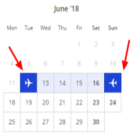
An input control to select one or more dates is almost indispensable in a travel website; nevertheless, there’s no such thing as an optimal implementation, so they usually become a source of confusion for users. There is no doubt that they’re a functionality that deserve particular attention during design and testing, which should take into account the following recommendations.
For example, not allowing a date previous to today for booking a reservation, or not allowing a return date previous to the departure.
Make the departure date visible enough when selecting the return date.
For some users it’s easier and/or quicker that way (but remember to show the accepted date format somehow).
Vouchers are a useful marketing tool in many cases, but it’s important to determine when they can be used during the buying process (usually it’s better in the final step), and how they influence users not having one. In some cases they can be even counterproductive, so it’s a good idea to consider some alternatives (for example, offering discounts depending on the authenticated user or where he/she comes from).
Aspects which can make a positive difference when compared to competitors.
Some authors identify three different profiles of e-commerce users. A good travel website should care for all of these profiles by offering, on one hand, a searcher which allows specific data for buyers to be entered, but on the other hand allows “open searches” with very few data which can be refined later depending on the results, for hunters and browsers. The latter will also benefit from “similar results” to the user’s search (e.g., in dates, prices or destines). Moreover, special sales and bargains will be interesting for browsers.
Browses through different options without a particular objective; their first thought isn’t to buy, but they might if they find something interesting.
Has an approximate idea of what she/he wants, but is still looking for the best option (many times, depending on the price); she/he is going to study and compare many alternatives before buying.
Has an exact idea of what he/she needs, and will buy it when he/she finds it.
As marketing experts already know (and is perfectly explained by Susan Weinschenk in her books), including social and/or emotional references greatly affects the buying decision. In this type of website, we can use different aspects of that kind.
“Only 3 available”; “last day”
One important point of optimization (also in travel websites) is identifying and avoiding the abandoned buying processes. In many cases they will just be the result of users looking for a better price, but they can also be a result of usability problems, which we won’t detect unless we perform a detailed study (because in the real world, users probably won’t complain; they’ll just leave). Analytics will help us to identify the particular step where the problem lies, and user testing will help us to know why.
We already know that any e-commerce website should adapt to mobile devices, which will probably represent more than 50% of visits. This is also true for travel websites, with an extra: they will probably be used for last-minute purchases (for example, when you are already at your destination). In this case, geographical and/or temporal proximity can be a key factor (“I need a nearby hotel for tonight”).
